Sample "How-To" PowerPoint Lessons
- Tips for Preparing Presentations
- Tips For Saving Prep Time
- Tips to Use When Presenting
- Tips When You Share Presentations
- View a Sample Lesson
Do you want to learn how to use PowerPoint well? Do you want your presentations to have a professional appearance and keep interest? Below you'll find a PowerPoint sermon slide show from Stan Crowley. This is great example of a good PowerPoint presentation based on an introduction to the New Testament book of Mark.
If you use the popular "ZIP" software for decompressing files then you can download a compressed version that will not take as long to download from the internet. If you do not know how to uncompress zip files then you can download the regular uncompressed version. It will take longer but can be saved to disk as is and be used immediately by PowerPoint(R).
Stan's presentation is an excellent example of a PowerPoint presentation that uses nothing but the tools available within PowerPoint itself. It gives terrific examples of slide builds and transitions to control the flow of the presentation and keep viewer interest high.
Make sure that you view the presentation in BOTH the "notes" mode and in the presentation mode to see the transitions, builds and author's explanation.
Download Zipped (Compressed) Version 48 kb
Download Unzipped (Regular Version) of Sample Slide Show 187 kb
If you run the above show in one window and this webpage in another window then you can view the whole show while reading the review.
Custom Animation
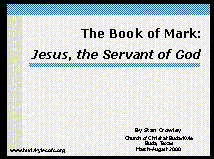
In the opening slide, Crowley makes use of what is called "custom animation". This allows him to control how text or graphics come on the screen. He has his title slide down from the top. Animation is useful in attracting attention to the portion of the show that you want attention. In PowerPoint 97 and 2000 you can do the same by simply right clicking on the text or graphic that you want to have motion and choosing "custom animation" from the menu that pops up on your screen.

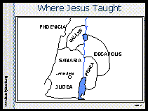
In slide #2, Crowley makes extensive use of custom animation. He has items both slide on the screen and slide off as they are no longer needed. Many people would make several slides of this one slide but the method that he uses is very efficient and keeps control of the presentation.
Controlling The Flow
This slide has 5 different animations. Crowley uses them to control the flow of the presentation. Many people put too much information on the slide at a time. When this happens, the audience may quit listening to the presenter and start reading ahead on the slide. By only bringing the information on the screen when the presenter is ready to talk about it, not only does the presenter keep the audience from wandering but also each animation catches the audience's attention and keeps them on track with the presenter.
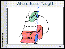 As the animation progresses, Crowley adds graphics that fill his previously black and white map. This brings attention to the locations that he is describing.
 Avoid Misuse Of Animations
It is not all that unusual for people to fill their shows with animations, sounds and special effects. The problem is that most people misuse them. Animations should only be used to draw attention to important point. They should not be used simply for "show".
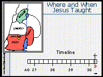
In slide 4, Crowley adds a timeline to explain when things happened on the map. Again, he only brings material to the screen as he presents it. He uses color fills to highlight the portions of the timeline that he is describing.
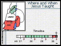
Making Your Own Fills
The color fills on the timeline are made by simply clicking on the "draw" menu, selecting the square tool and making a blocks of color the same size as his timeline. He make the multiple blocks into one graphic by selecting all of the individual blocks, right clicking on the set and selecting "grouping" then "group" from the popup menu.
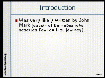 Slide #7 shows the use of what is called "builds". "Builds" are useful for lists. In a "build", each item in the list only comes up when the presenter activates it. In Crowley's build, he also designated that as new lists come up that the previous list items be "dimmed" so that the new item attracts more attention.
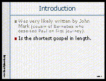
Again, the purpose of builds is to control the flow of the presentation and to make sure that material is brought to the attention of the audience as the presenter is ready to talk about it.
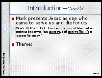
Finally, in slide 10, Crowley uses color, motion and a graphic box to attract attention to his major point on the slide. He wants to give special attention to one statement. He uses the bright red color for attention, adds a red box and motion to make sure that no one misses his point.
Manual Controls
You may note that with the exception of the very first slide, Crowley almost exclusively manually controls when the animations occur rather than allowing PowerPoint to start the animation on a timer. This is all part of controlling the flow of the presentation. This allows Crowley to talk as long as he wants between presented points on the slide show. Should someone ask a question, the slide show stops, when Crowley resumes his planned program, an animation recaptures the audiences attention to the screen. When Crowley wants to talk, the screen stops moving.
Extra Control
Sometimes the presenter may want to completely turn off the presentation and have all the attention on what they are saying. It is easy to do this in PowerPoint. While showing a presentation, simply press the "b" key. The slide show will go to a black screen, pressing any other key resumes the show. This is an effective method of controlling the presentation and audiences attention.
More Things to Learn from This Presentation
Crowley continues to use variations of the same techniques throughout the slide show. Make sure that you download the show and run it in presentations mode to see the effective way that he utilizes the features of PowerPoint.
What Crowley Didn't Do
Perhaps some of the most important things we learn from Crowley's presentation are the things that he doesn't do. Note that Crowley doesn't use a different transition from slide to slide. One mistake of beginners is to use animations and slide transitions simply because they can. It is common to see them select the random slide transition effect. When you select this feature you get a lot of interesting action on the screen but after a few slides the audiences attention is no longer on what you are saying but rather on looking at what neat cool effect they will see next. Animations, special effects and sounds should only be used when they have the purpose of drawing attention to the point being made. Too much activity is actually a distraction.
Fonts
When you go back and look at the details of his presentation you will also note that he uses the same font style throughout the presentation. The one exception is the scripture quotation on slide #10. There, Crowley puts the scripture text in a font that is similar to what is found in most Bibles. This visually, helps people realize that they are actually reading Bible text rather than one of Crowley's comments. In this case, Crowley's one recommendation for this presentation is that Crowley should have probably used a larger font size or bold text for the scripture quotation to make it easier to read.
Overall, this is an excellent presentation. You can see more of Stan's work on his church's web site which is listed later on this page.
About Stan Crowley
Stan Crowley is the minister of the Church of Christ in Buda, Texas. Stan has been published in a variety of magazines such as Gospel Advocate, Christian Bible Teacher, Firm Foundation and Power For Today. He has also written a wide variety of documents both technical and religious. In addition to education at Abilene Christian University, Stan has a doctorate in Physics from the University of Virginia. He spent most of his career doing research and entered full time ministry in 1996.
We have several free sample sermons by Stan Crowley as well as a 20 sermon disk available with speakers notes and more.
Click here for free Sermons with notes by Stan Crowley
